

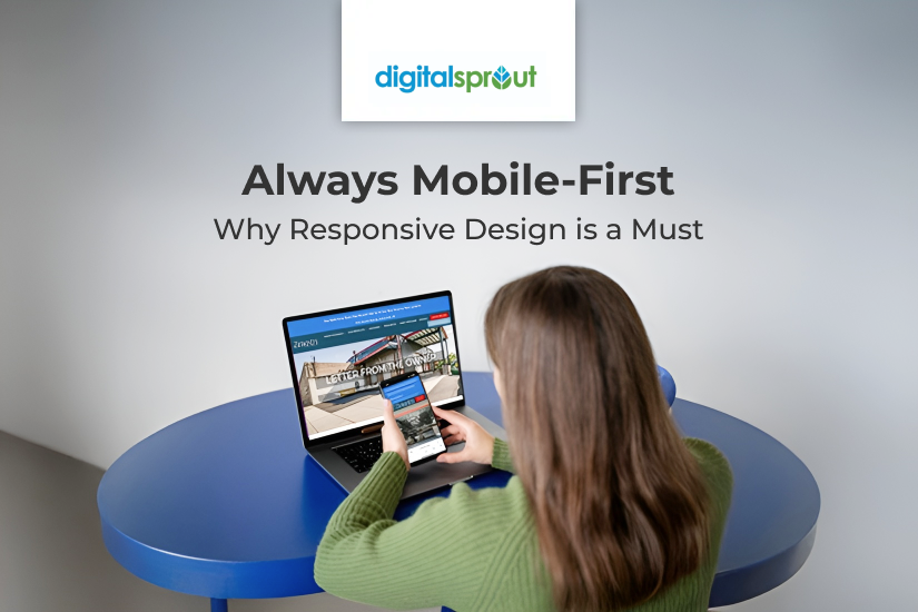
Did you know that over 60% of all web traffic now comes from mobile devices? As smartphones and tablets become the primary tools for browsing the internet, a website that adjusts effortlessly to different screen sizes is no longer optional; it’s essential. That’s where responsive website design comes in.
A responsive web design ensures that your website adapts seamlessly across desktops, tablets, and mobile phones, creating a consistent user experience and stronger brand impression. It also plays a major role in your site’s SEO performance, user engagement, and revenue.
Let’s explore the top reasons why responsive web design is critical for your online success.
1. Simplifies Maintenance and Updates
Responsive web design allows you to manage a single version of your website. This means that whenever you update content, edit a page, or add a new section, the change reflects across all devices.
Maintaining separate desktop and mobile websites is inefficient and outdated. It doubles your workload and increases the risk of inconsistencies. With responsive website design, you save time, reduce errors, and ensure a smoother content workflow.
If you’re planning to redesign your website, prioritize mobile responsiveness. It simplifies your life and future-proofs your site.
2. Improves SEO and Google Rankings
Google uses mobile-first indexing, which means it prioritizes the mobile version of your website when determining rankings. A responsive site performs better in search engine optimization (SEO) because it uses a single URL structure across all devices, making it easier for search engines to crawl and index your content.
Having a mobile-friendly site also reduces bounce rates and improves page speed, both of which are important SEO ranking factors.
According to Google, 53% of users will abandon a mobile site if it takes longer than 3 seconds to load.
Responsive web design ensures your website not only looks good but also ranks well, helping you attract more organic traffic.
3. Streamlines Analytics and Performance Monitoring
Tracking user behavior is much easier when you operate one website instead of multiple device-specific versions. A responsive design centralizes your data in tools like Google Analytics, giving you a clear overview of how users interact with your site, regardless of the device.
You’ll spend less time segmenting and combining reports, and more time acting on insights to drive performance improvements. Monitoring key metrics, such as bounce rate, conversions, and user paths, becomes more efficient with a single, responsive platform.
4. Enhances User Experience
User experience (UX) is a key driver of conversions. If visitors struggle to navigate your site on their phones – pinching, zooming, or scrolling side to side – they’re more likely to leave.
Responsive web design automatically adjusts layout, images, fonts, and navigation based on screen size. This ensures smooth usability across all devices, resulting in longer session durations, lower bounce rates, and a higher conversion rate.
When visitors have a positive experience, they’re more likely to return and recommend your brand.
5. Boosts Sales and Conversion Rates
A mobile-optimized site makes it easy for users to browse, engage, and make purchases without friction. Whether your goal is to generate leads, sell products, or collect email signups, a responsive website design removes the barriers that typically lead to user drop-offs.
Research shows that mobile users are five times more likely to abandon a site that isn’t optimized for their device. That’s a huge missed opportunity if your site isn’t responsive.
By offering a unified, professional, and user-friendly experience, you’re more likely to see an increase in sales, conversions, and ROI.
The Bottom Line
Responsive web design is no longer a trend; it has become the standard for modern websites. It improves visibility on search engines, enhances user experience, simplifies backend operations, and most importantly, helps convert visitors into customers.
If your website isn’t responsive yet, you’re not just missing out on mobile traffic; you’re likely losing potential business every single day.
Want to fix that?
Reach out to the expert team at Digital Sprout, your trusted web design and SEO company in Maryland, to future-proof your online presence.